


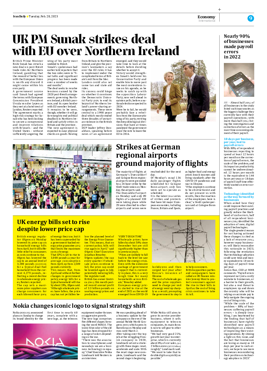


Nokia changes iconic logo to signal strategy shift
Nokia (NOKIA.HE) announced plans on Sunday to change its brand identity for the first time in nearly 60 years, complete with a new logo, as the telecom equipment maker focuses on aggressive growth.
The new logo comprises five different shapes forming the word NOKIA. The iconic blue color of the old logo has been dropped for a range of colors depending on the use.
“There was the association to smartphones and nowadays we are a business technology company,” Chief Executive Pekka Lundmark told Reuters in an interview.
He was speaking ahead of a business update by the company on the eve of the annual Mobile World Congress (MWC) which opens in Barcelona on Monday and runs until March 2.
After taking over the top job at the struggling Finnish company in 2020, Lundmark set out a strategy with three stages: reset, accelerate and scale. With the reset stage now complete, Lundmark said the second stage is beginning.
While Nokia still aims to grow its service provider business, where it sells equipment to telecom companies, its main focus is now to sell gear to other businesses.
“We had very good 21% growth last year in enterprise, which is currently about 8% of our sales, (or) 2 billion euros ($2.11 billion) roughly,” Lundmark said. “We want to take that to double digits as quickly as possible.”